
Statistical Process Control Charts: Process Variation Measurement and Management
The complication of any process, manual or automated, is that it will exhibit variation in the performance of the process. How we measure and manage that variation is the function of statistical process control charts. SPC is measured by a number of control chart types; each representing a specific spc tool needed. Our purpose is to discuss different types of statistical process control charts, and how they help us manage the process.
The type of control chart we select — and there may be multiple SPC chart types chosen — depends on the process and what information we want to measure about that process.
A statistical process control chart is fed by data; the objective, raw information we collect from an operating process. Data is derived by observance and measurement of characteristics of the process. First, we must determine if the specific information we want to gather and manage is attribute or variable data.
Attribute data is information that is discreetly observed; the values can only be integers. Data points are counted, not measured, and noted on an SPC chart, and answer questions of how many, how often, or what kind. A data point is triggered whenever the feature being watched is observed.1 As a result, go/no-go, or pass/fail-type data, which is counted data, is attribute data.
Variable data is information that is continuously measured; the values are any real numbers that are measured and noted on the SPC chart. They answer questions like how wide, what weight, how much time passed. Variable data is usually measured by an instrument devised for that data measurement purpose, such as micrometers, a weight scale, or a clock.2
Variable, or measurement data, is usually considered more accurate than counted attribute data. It is precise. It not only designates a specific type of defect, for example, a paint scratch (attribute) on a control chart; it can reveal the depth and length of the scratch and the volume of displaced of paint (measurement variables). However, attribute data has its place in statistical process control, particularly when there are multiple defects that can affect the product of a process, and there is a need to distinguish between them. The point is; there are specific types of control charts for each type of data.
For purposes of this article, we will examine four types of statistical process control charts. Refer to the chart below.
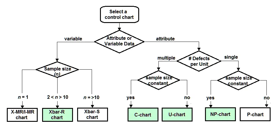
Shown are the most popular and frequently used SPC charts based on the primary decision of choice between attribute and variable data. On the left, variable data SPC charts depend on sample size, as shown. Of these chart types, the most popular is the Xbar-R chart, based on a sample size range of 2 through 10, which accommodates most process conditions.
On the right, attribute SPC charts also depend on sample size, but vary depending on whether the process is designed to verify multiple defects per unit, or a single defect per unit, and then, secondarily, whether sample size is constant, or not.
For the purposes of this article, we will examine the details of the following SPC Charts: Xbar-R chart, C-Chart, U-Chart, and NP-Chart. For simplicity, we will use the same data to represent the process measured by each statistical process control chart.
Xbar-R Chart (variable data)
The Xbar-R Chart is the proper choice when dealing with variable data and a sample size between 2 and 10 samples for every periodic measurement. Refer to the chart below, which represents the measurements of a feature of a product through a process, with 5 samples taken each hour over 24 hours; two shifts of 12 hours, each, the changeover of which is represented on the chart between lots 12 and 13.
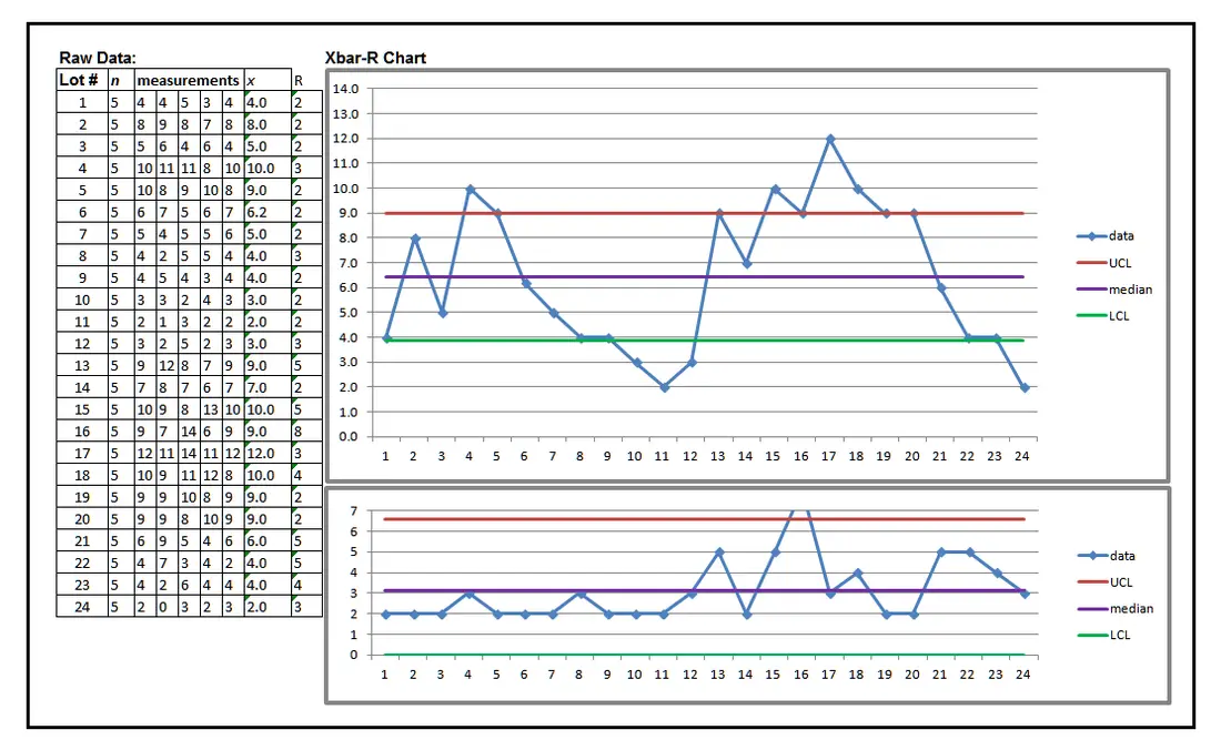
The Xbar-R SPC Chart is divided into two sets of data
- The averages of each 5-sample measurement each hour, 1 through 24, which is coded as the averaged data points.
- The averages of the range of measurement of the 5 samples each hour, 1 – 24, which is coded as the average range of data points.
- the upper control limit (UCL)
- The median, also called Double-X-bar, the average of averages of data.
- The lower control limit (LCL)
- Xbar Chart
- In the Xbar Chart, data points exist beyond both UCL and LCL.
- Both the first and second shifts demonstrate that the process violates the control rule of 5 or more continuous data points in a trend (a continuous run of increasing or decreasing values). We see this occur between lots 5 to 11 in the first shift.4
- The process violates the trend rule, again, between data points 17 to 24 in the second shift.4
- The process violates the control rule of 7 or more continuous data points in a run on the same side of the median (data points 13 through 20), called a process shift.4 It is expected that a process will randomly cross the median.
- R Chart
- The R Chart is an SPC chart with a different pattern because this data represents the minimum to maximum range, or spread, in each hour’s 5 samples’ data. This data is also controlled by control limits, upper and lower, and a median value. It indicates another condition of being out of control, especially in the spike of range in the 16th hour which is off the chart, clearly indicating an issue of special cause.
- The R Chart exhibits another out-of-control condition. The process violates the control rule of 7 or more continuous data points in a run on the same side of the median (data points 1 through 12), which represents the entire first shift. This is a concern, even though it would appear to be in control because all data points show a minimum drift from the median, and all points are within control limits. However, the run rule identifies the possibility of inaccurate or improper measurement technique. We should expect a more random distribution of measurement data.
C-Chart (Attribute Data)
Below is an example of a C-Chart. In this example SPC chart, the data represents the number of defects found in each lot of 100 samples from a production run of a product.
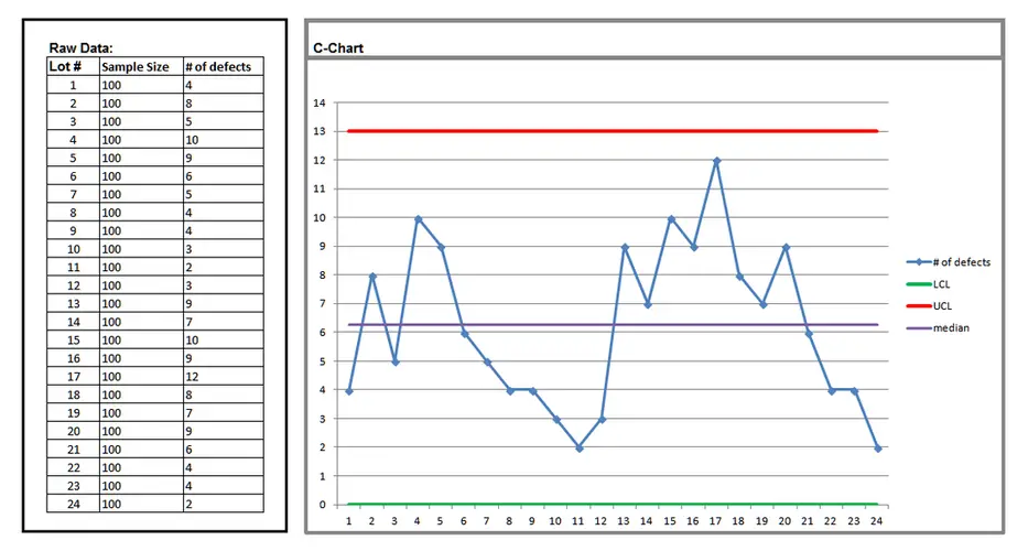
The raw data tells us there are 24 lots with samples of 100 parts per lot. Each lot has the counted total of defects found. Although the raw numbers contain all the information needed, it is difficult to derive, from the numbers alone, some important features of this process that the C-Chart reveals because of how it reflects the raw data.
This control chart displays similar information to the Xbar-R chart, above, i.e., data points (in this case, they are individual data points; the number of defects found in each sample of 100 parts. It also shows a median value and upper and lower control limits.
We can quickly see that the process appears to have remained in control over the two shifts — no data point exceeds the control limits — however, there are three issues seen on the SPC chart that exhibit an out-of-control condition and need to be watched, analyzed, and corrected.
- The process violates the control rule of 5 or less continuous data points in a trend (a continuous run of increasing or decreasing values). We see this occur between lots 5 to 11) in the first shift.4
- The process violates the control rule of 7 or more continuous data points in a run on the same side of the median (data points 13 through 20), called a shift.4
- In the second shift, the process violates the trend rule, again, between data points 17 to 24.4
U-Chart (Attribute Data
Below is an example of the U-Chart, a control chart used when multiple defects per unit are expected, but the sample size is not expected to be the same throughout the production run. Note in the n (samples size) column in the raw data, highlighted in green, the sample size varies hour by hour.
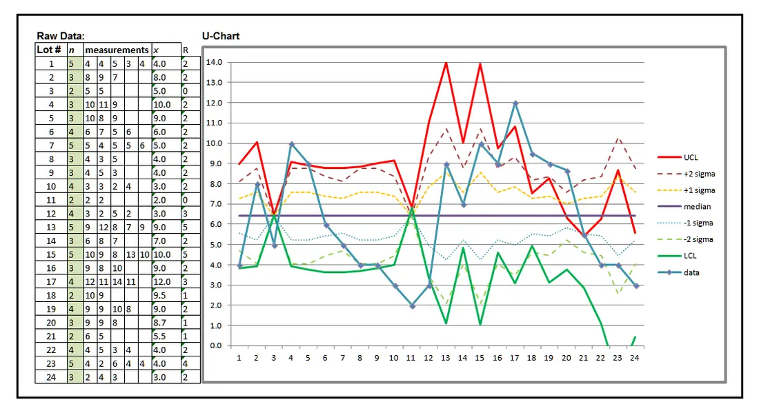
The U-Chart appears complicated, but only because there are multiple data types represented:
- UCL
- +2 sigma (2 standard deviations)
- +1 sigma (1 standard deviation)
- Median (Double xbar, or average of averages)
- -1 sigma
- -2 sigma
- LCL
- Data average
- The process violates the trend control rule (a continuous run of 5 or more increasing or decreasing values) between data points 4 to 11 in the first shift, and points 17 to 24 in the second shift.4
- The process violates the control rule of 7 or more continuous data points in a run on the same side of the median (data points 6 through 12, and 14 to 21).
- The data average, +2 sigma, and +1 sigma all exceed UCL in the second shift.
- Both UCL and LCL have data crossing the median; evidence of either a very erratic, accurately measured process, or a complete failure of measurement technique; not to mention that LCL dips beneath a zero value (data point 23), which is a virtual impossibility in a properly operating process.
This is not to say that a process must produce an identical number or products per hour and per shift, but the variance cannot be too great or the statistical accuracy of the data analysis will be suspect.
Granted, the U-Chart is not the most frequent SPC tool in use, but it does have a place and will accurately monitor a process of widely variable production numbers hour by hour. Usually, this will represent a process that completely lacks automation, or even a typical assembly line process. A limited pre-production design verification run is a good example of when a U-Chart might be the best SPC chart to use.
NP-Chart (Attribute data
The NP-chart is similar to the U-Chart (there may be multiple defects per product), but is used when the sample size is a constant value throughout the process run. As a result, UCL, +2 sigma, +1 sigma, median, -1 sigma, and -2 sigma are represented as constants on the chart.
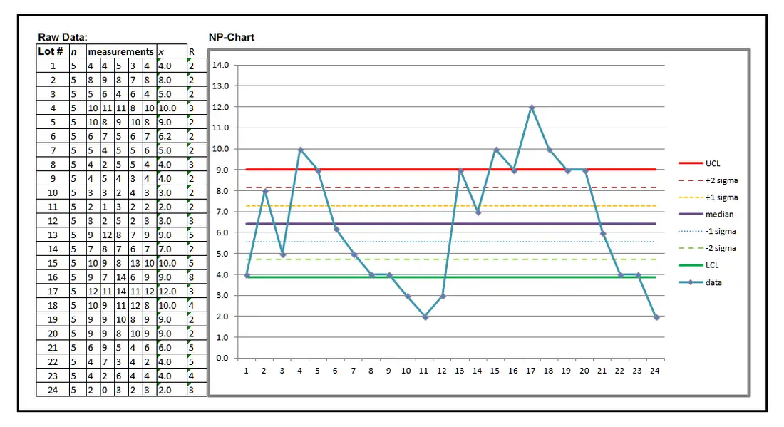
As you might expect, the NP-Chart also demonstrates that this process is out of control, but, given the lack of the complication of non-constant sample sizes, the chart is much easier to understand.
Note that the process violates UCL and LCL repeatedly in both shifts, as well as demonstrating violation of the trend and run rules that are expressed in each of the other statistical process control charts we have examined.
Note that the process violates UCL and LCL repeatedly in both shifts, as well as demonstrating violation of the trend and run rules that are expressed in each of the other statistical process control charts we have examined.
Conclusion: The value of statistical process control chart
SPC tools like the foregoing charts are vital to process control. As seen, just about any process circumstance of conditions has an appropriate SPC chart that will most efficiently track that process for the purpose of statistical process control and improvement.
The data represented on an SPC chart, if accurately obtained, will summarize a great deal about the success or failure of a process. By watching particularly for trends and runs, according to their specific rules which may occur in any process, in addition to monitoring the process average relative to control limits, reaction to trends and runs can be accomplished well before the process actually reaches an out-of-control condition.
That is, by the use of the various statistical process control rules above and beyond monitoring of results relative to control limits, an endangered process can be corrected while that process is still producing acceptable product. The ability to do so is one of the greatest advantages of using statistical process control charts. The various control charts at hand for the process engineer will faithfully guide process correction, or, better yet, assure that the process is operating in control on a continuing basis.
This means that the process engineer, Six Sigma Black or Green Belt, or other functionaries responsible for maintaining good process control, can depend on these control charts to accurately guide their workload.
Beyond vital process monitoring, acquiring the skills necessary to make use of an SPC chart can assist in instances of process correction requirements.
However, beyond even this necessary job function, the use of additional statistical process control charts other than the typical Xbar-R, allow detection of subtle nuances in a process that signal the potential, or real failures that can be identified and acted upon. For example, we note that by use of various other control charts, the suspicion of end-of-shift issues occurring beyond the scope of normal, expected process variation (common cause issues) can be detected. These are special cause issues; issues that are not typically expected, but are known to occur due to unexpected circumstances.
It is well known that a statistical process control chart ought to be used to monitor the stability of virtually any process, and to take actions as necessary to demonstrate repeatability once achieved. We use a control chart to assure ourselves of the control, or, if possible, the elimination of common causes of failure.
However, it is just as vital to a process that we have the ability to improve our forecast of process performance by analysis of the less frequently used statistical process control chart types we have discussed. By manipulation of the raw data through the characteristic features of other control charts, we become more sensitive, and more analytical, to the process nuances that may be hidden in a traditional control chart like Xbar-R.
If we agree that the accurate identification of process variation is the key objective of statistical process control, we must conclude that we are better off if we have multiple perspectives in observing, measuring, collecting, and analyzing process data on a control chart in order to limit the degree to which variation adversely affects the process.
What we must avoid is the mistaken opinion that variation is necessarily a bad effect. It is true of excessive variation, but we must always remember that a process must exhibit some variation to demonstrate a healthy, controlled condition. The apparent lack of variation when it should occur is most easily identified by recognition of conditions like trends and runs, both of which indicate the lack of random variation.
We return to where we began: that natural variation rightly occurs in a healthy process, and that SPC control charts assist us in its identification. Variation is most easily observed as it occurs by applying one or more control charts to the process.
Once we analyze the results of natural variation on a statistical process control chart, and observe any or all conditions of lack of control, we can more easily identify root cause and begin the process of correction and/or prevention. By so doing, we achieve the second objective of any statistical process control: improve it.
References:
Wortman, Bill, Certified Six Sigma Black Belt Primer, Quality Council of Indiana, Terre Haute, IN, 2001 (First Edition), VI-21
http://www.isixsigma.com/tools-templates/control-charts/a-guide-to-control-charts/