Lean Six Sigma Training Guide Copy
  • Free Lean Six Sigma Training Guide
  • New Page
  • IASSC Free Training Guide
  • ASQ Free Training Guide
  • Practice Exams
    • Six Sigma Quick Training Tests >
      • Lean Six Sigma Practice Test 1
      • Lean Six Sigma Practice Test 2
      • Lean Six Sigma Practice Test 3
      • Lean Six Sigma Practice Test 4
      • Lean Six Sigma Practice Test 5
      • Lean Six Sigma Practice Test 6
      • Lean Six Sigma Practice Test 7
      • Lean Six Sigma Practice Test 8
      • Lean Six Sigma Practice Test 9
      • Lean Six Sigma Practice Test 10
      • Lean Six Sigma Practice Test 11
      • Lean Six Sigma Practice Test 12
    • Six Sigma DMAIC Training Tests >
      • DEFINE Six Sigma Training Test
      • MEASURE Six Sigma Training Test
      • ANALYZE Six Sigma Training Test
      • IMPROVE Six Sigma Training Test
      • CONTROL Six Sigma Training Test
    • IASSC, ASQ and Other Exams >
      • IASSC Six Sigma Black Belt Exam
      • IASSC Six Sigma Green Belt Exam
      • IASSC Six Sigma Yellow Belt Exam
      • Lean Six Sigma Exams By Topic >
        • I. Enterprise-Wide Deployment >
          • A. Enterprise-wide view
          • B. Leadership
        • II. Organizational Process Management and Measures >
          • A. Impact on stakeholders
          • B. Critical to x (CTx) requirements
          • C. Benchmarking
          • D. Business performance measures
          • E. Financial measures
        • IV. Define >
          • A. Voice of the customer
          • B. Project charter
          • C. Project tracking
        • V. Measure >
          • D. Basic statistics
      • ASQ Six Sigma Black Belt Exam
      • ASQ Six Sigma Green Belt Exam
  • Six Sigma Materials
    • The Problem Solving Strategy Y = f(x) in Lean Six Sigma
    • Value Stream Mapping Explained
    • Pareto Analysis And Pareto Chart Explained
    • Best 5 Free Online Degree Programs In 2017
    • Cost Of Poor Quality (COPQ) Explained
    • Best 4 Free Online Certifications To Boost Your Resume
    • Pareto Analysis and Pareto Chart
    • Why Six Sigma Certification?
    • Six Sigma Green Belt Training
    • General History of Six Sigma & Continuous Improvement
    • Walter Shewhart Biography
    • Basic Lean Six Sigma Metrics
    • How to Make a Histogram
    • Statistical Process Control Charts
    • Lean Six Sigma Term Glossary
    • Kaizen and Kaizen Blitz
    • Central Limit Theorem
    • Six Sigma Symbols
    • Six Sigma Tables >
      • Z Score Tables
      • T Distribution Table
      • Chi-Square Distribution Table
      • F Distribution Table
      • Poisson Distribution Table
      • Cumulative Poisson Distribution Table
    • Six Sigma Diagrams >
      • Choosing a Right Parametric Test
      • Choosing a Right Control Chart
      • Commonly Used Lean Six Sigma Flowchart Symbols
      • ​Ishikawa (Fishbone) Diagram
      • Histogram
      • Scatterplot
      • Check Sheet
      • Failure Mode and Effects Analysis (FMEA)
    • Lean Six Sigma Belt Roles and Responsibilities
    • 5S
    • How to get six sigma certified?
    • International Six Sigma Certification Association (IASSC) Exam Reference Document
    • Useful Websites and Tools
    • 10 Best Free Udemy Courses That You Can Take Online
    • 5 Best Udemy Courses You Can Take Today
    • The Complete Web Developer Course 2.0 You Can Take Online | Udemy
    • 12 Best Probability and Statistics Online Courses and Classes [2018 Guide]
    • 15 Best Data Science Degrees, Courses and Certifications [2018]
  • Six Sigma Glossary
    • 5 Whys
    • Analytical and Descriptive Statistics
    • Brainstorming
    • Cost Of Quality
    • Design for Six Sigma (DFSS)
    • Efficiency of Estimators
    • Process Maps and Flow Charts
    • Gap Analysis
    • Common & Special Cause Variation
    • Quality Function Deployment (QFD)
    • In Control Process
    • Interest-Based Bargaining
    • Internal Customer
    • ISO9000
    • Kaizen Blitz
    • Kanban
    • Kano Model
    • Key Performance Indicators (KPI)
    • Lean Production
    • Management Strategies
    • MANOVA
    • Multivariate Analysis
    • Pareto Charts
    • Pareto Principle
    • PEST Analysis
    • Porter's Five Forces Analysis
    • Factor Analysis
    • Procedures
    • Process
    • Project Charter
    • Project Sponsor
    • Pull Production System
    • QS9000
    • Random Sampling
    • Failure Mode & Effects Analysis (FMEA)
    • Rolled Throughput Yield
    • Root Cause Analysis
    • Scenario Planning
    • Seven Quality Tools
    • SIPOC Diagrams
    • Six Sigma
    • SWOT Analysis
    • Systematic Sampling
    • System (Quality System)
    • Team Tools
    • Theory of Constraints
    • Throughput
    • Total Productive Maintenance (TPM)
    • Touch Time
    • Value Stream Maps
    • Visual Factory
    • Work In Progress (WIP)
    • Work In Queue
    • Work Instructions
    • Big Y
    • Control Plan
    • Waste
    • Evolutionary Operation of Processes (EVOP)
    • Cause & Effect Diagrams
    • 5C
    • 5Z
    • Project Selection
    • 8D Process
    • Appraisal Cost
    • Audit
    • Baseline
    • Business Process Quality Management
    • Check Sheet
    • Unintended Consequences
    • Voice Of The Customer (VOC)
    • Critical to Customer (CTC)
    • Critical To Quality (CTQ)
    • Customer Focus
    • Efficiency
    • Empowerment
    • Entry Criteria
    • Exit Criteria
    • Voice Of The Process (VOP)
    • Just In Time (JIT) Manufacturing
    • KISS
    • DMAIC
  • Six Sigma Blog
  • Forum
  • About Me
  • Privacy Policy
  • Contact
  • Top Free Online Courses With Printable Certificates

How to Make a Histogram

Tweet
​This article explains how to make a histogram and how to use it. Histogram is a graphical analysis tool widely used in statistics. It is one of seven basic quality tools of process improvement. Histogram graphs frequency of data value occurrences and is often a handy tool for successful lean six sigma project implementation and quality improvement. It is a diagram consisting of bars which correspond to how often a data point or a group of data points fall within a predefined interval. Histograms help visually glean how data is distributed within a given data set and draw conclusions. For example, we may have a data set on the salaries of 25 employees and would like to know how they are distributed. 
See also:
  • Choosing a Right Parametric Test
  • Choosing a Right Control Chart
  • Z Table
  • T Distribution Table
  • Pareto Chart and Analysis
  • About Six Sigma Certification
histogram example
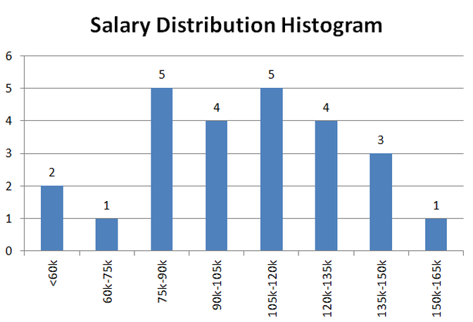
​By looking at the salary distribution histogram we can quickly tell that most employees from a sample earn medium range salaries as the highest frequency occurs in the middle. 18 people out of 25 earn between $75,000 to $135,000. Now you are probably asking how to create a histogram. It is not complicated just follow the simple steps below to make a histogram.

​                                                        How to make a histogram

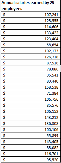
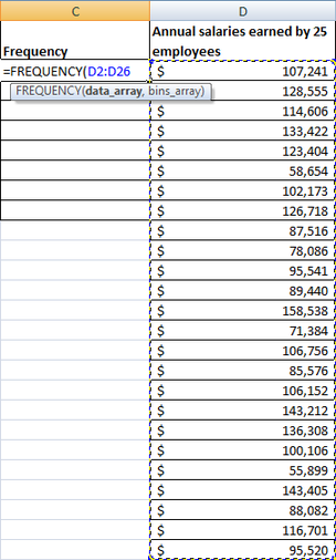
Before laying out a step by step instruction on how to make a histogram, we need to have a data set that we would like to analyze and describe. Let’s use already mentioned data on salaries of 25 imaginary employees. Here is a list containing raw data on how much twenty five employees make per year.
raw data for frequency distribution

 First step to make a histogram is to create intervals

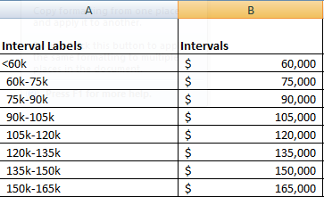
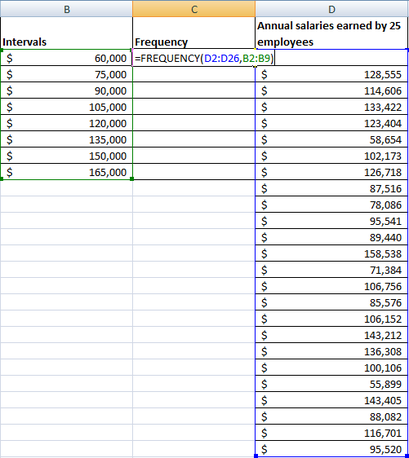
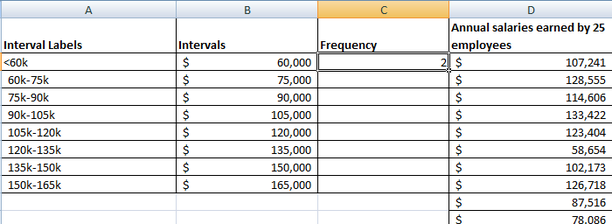
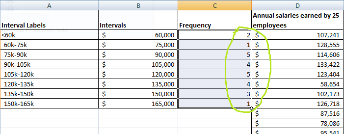
​In order to create a histogram we need to develop a frequency table which will group our raw annual salary data by predefined intervals (or as statisticians like to refer to them bins). In our example, let’s use bins ranging from under $60K through $165K. Each interval has $15,000 spread. In excel you can create two columns for intervals. The column labeled “Intervals” will be used to group salaries by the intervals that they belong to. We will use “Interval Labels” for labels when we make a histogram chart.
create intervals for a histogram

Second step: run a frequency distribution formula

In the same excel spreadsheet where we have salary list, intervals and interval labels let’s create a column called frequency.
frequency distribution table for a histogram
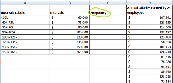
Then we need to run a FREQUENCY formula in excel which will group salary frequencies (i.e. a count of people who fall within an interval) by appropriate interval. We highlight a list of salaries to be included as the data_array. Then highlight intervals to be included as bins_array and hit ENTER.
Picture
Picture
The screen should look like this:
Histogram and frequency table in making
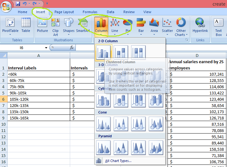
​It takes a little trick to copy and paste the formula to the rest of the blank cells under Frequency column. The FREQUNECY formula will not be pasted to the rest of the blank cells by just using copy and paste. Instead you would need to highlight all the blank cells under Frequency where you would like the formula to be applied and then go to a formula bar and click on the formula as illustrated below:
step by step guide to make a histogram
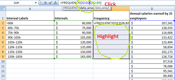
Click CTRL+SHIFT+ENTER at the same time. You will see the Frequency column getting populated with numbers.
excel table example

Thirds step creating a histogram

​The last step demonstrates how to create a histogram using a bar charting function of excel. Once we develop a frequency table (that’s exactly what a set of numbers under the Frequency column is), we can highlight the numbers and then go to INSERT>COLUMN and select the first clustered column chart.
how to create a histogram
A histogram that we just made should pop up on the screen.
histogram bar chart in excel
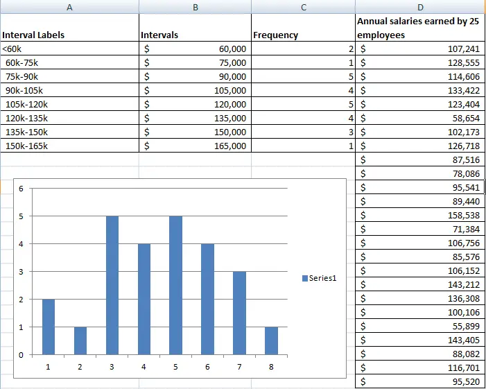
​In order to add interval labels to the X axis of the histogram that we just made, right click the chart with the histogram. Click select data and Edit for horizontal axis labels and highlight the interval labels. That's all. We just created a histogram.
Finally I am making an excel file available for you to practice all the histogram development steps. You will find the discussed data , tables and the chart in this file. I recommend to copy the list of the salary raw data and try to recreate the frequency distribution table followed with a histogram. You can also use RANDBETWEEN function to develop a dummy data set if you desire to play with a larger data set or a data set with a different range of values. With this function you can define upper and lower range limits and let excel do the rest.
create_a_histogram.xlsx
File Size: 12 kb
File Type: xlsx
Download File

This video shows how to develop a histogram 

Powered by Create your own unique website with customizable templates.