Pareto Charts
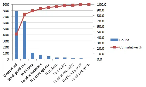
The Pareto Chart is one of the most common charts used by management inside organizations. The Pareto chart is an ordered histogram that allows you to see the frequency of occurrence of defects.
The Pareto Chart needs to obey the Pareto Principle or the 80/20 rule that says that 80% of the outcomes come from 20% of your inputs.
The most usual representation of the Pareto chart is a histogram chart that displays the defects in order of frequency (the more common mistakes appear from the left to the right). Besides the histogram, it's also common to see a line that represents the cumulative total.

