
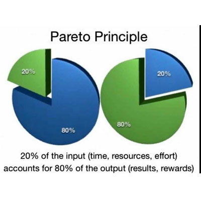
When you need to deal with different problems at the same time, it might be difficult to know which one you should address first. One of the ways many people do is to use the Pareto analysis. You probably already heard about the 80/20 rule or the Pareto's rule and it is usually used to control the quality. Despite it was originally formulated to study the distribution of wealth, it became known as the Pareto analysis.
The meaning of this rule is pretty straightforward: it simply states that 80% of the quality problems in the final service or product are caused by 20% of the problems in the processes of production. So, as soon as these problems are identified, you'll be much more efficient regarding quality.
The Pareto analysis can be used in many different ways inside your organization. It can help you improve your processes, as already mentioned, it can eliminate the workers who are wasting time by the human resources, and it can be used to discover a big problem that's preventing your company to reach a goal.
Usually, when the Pareto Analysis is done, the results tend to be displayed on a Pareto chart. This kind of visualization of the data has different objectives:
- It arranges the data according to its importance or priority;
- It helps separate the main problems from the smaller ones, so you know where you need to concentrate your efforts;
- It helps you see the real problems and not the perception of a problem since you're basing yourself on real data;
- It allows you to better use your limited resources.
When you use a Pareto chart, you'll be able to see the entire data about the process broken down into the different categories. And since the Pareto chart displays the data in hierarchical order, you'll be able to immediately identify the problems where you need to focus first. Due to the fact that the Pareto chart is very versatile and provides unique information, it's one of the most used charts in management presentations.
According to the Pareto principle, the areas where you have more problems should be the ones that should be addressed first. This way, the Pareto chart is a great way to easily identify those areas.
The next step should be thinking about how to make a Pareto chart.
According to the Pareto principle:
Stage #1: Identify the possible causes of low quality:
There are many ways to complete this stage. You can do some brainstorming, surveys, focus groups, or apply any other method that you believe will suit the needs. The ultimate goal is to know exactly what the causes may be. Let's say that you manufacture glass and that, somehow, you've been getting many returns because of the cracks. The problem may be on the mishandling when they're still in the factory, the package may not be resistant enough, you can have a poor production process, or there may be problems when they're being transported.
Any of these issues may be the cause or one of the causes of the problem. So, it's time for the next stage.
Any of these issues may be the cause or one of the causes of the problem. So, it's time for the next stage.
Stage #2: Establish a period of time:
When you're looking on how to make a Pareto chart, you need to establish a period on which you are conducting the full analysis and the assessment. What you need here is to have a sample of a determined period of time that will allow you to improve the quality of your product or service. There's only one thing that you need to remember. In case you have a seasonal business, you need to make sure that the data sample that you collect will be appropriate and that will allow you to withdraw the right conclusions.
Once you selected the time period, you will need to make the necessary match to one of the causes of the low quality that you identify during the first stage. If you look at the previous example, when you get a return stating that there was a misleading in the factory, you need to add one to this cause. If you get a returned glass that says the package wasn't strong enough, then add one here as well.
This stage only ends when the period of time that you pre-determined to get your sample data is finished.
Stage #3: Summarize & visualize:
During this stage, you'll need to get the subtotals for each different cause of the poor quality of your product. And when you have all these subtotals, its sum will give you the total number of defects that your product had in that specific period of time.
But how can you make a Pareto chart from here? The first thing you'll need to do is to acquire the percentages of each cause, in relation to the total number of defects. All you have to do is to divide each subtotal by the total number of defects and multiply by 100.
Once you get all the percentages, you can finally draw your Pareto chart in a histogram. You'll use the causes of the poor quality on the x-axis, and on the y-axis, you'll have the percentages of their occurrences.
The most often cause should be put on the left, and the others should follow in that order. To make sure that you can immediately see what's happening, you should also draw a cumulative line graph that should be placed over the histogram bars.
Stage #4: Interpretation and applying the results:
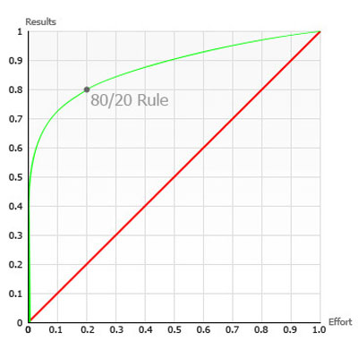
In this stage, it's important to have present the 80/20 rule. You'll notice that, in most cases, 80% of the products with defect were caused by around 20% of the possible causes.
One of the things that you should have in mind is that after you have implemented the solutions for the first cause of defects, you should do another Pareto Analysis. The percentages relative to the other causes will be substantially different so, the effort is worthwhile.
The Pareto chart isn't the only diagram that can be used to look for the problems in your processes that can affect your products or services quality. Learn about various diagrams used in DMAIC six sigma methodology.